Tuesday, November 8, 2011

The Site

For heating degree days (HDD), sunlight, and other considerations.

The existing footprint is located at:
43°37'40.50"N
70°12'55.25"W

The front-back walls face SE to NW with the best views in the NW and NE quadrants.  The opposite SW and SE quadrants receive all of the sunlight.  The solstice sunrise and sunset lines are shown in the Google map below:


View Maiden Cove 4 in a larger map

We computed HDD (Heating Degree Days) from three-year weather observations from Portland Jetport, Naval weather buoys, and private weather stations on the coast of Maine within 50 km of the site.  The computations correlated well with NWS data compiled 1981-2010.
  • January is the coldest month at -5.1C average temperature
  • July is the warmest month at 20.5C average temperature
  • Rainfall is very uniform, averaging 3.94 inches per month, with a standard deviation of 0.58 inch (NWS 1981-2010)

HDD in F and C at 20C base temperature show:


We believe the city will allow building on the existing footprint, an area of approximately 2000 sq. ft.

Overlaying the the house floor plan dimensions from the original blueprints on the site shows the following:


The garage is on-grade on the SW side.  The remainder of the ground floor is supported by a concrete block wall foundation, providing an above grade basement on the downhill slope of the property.   The 2-D footprint floats over the Google Terrain mock-up:


Monday, November 7, 2011

An aside on stairs, two stories, and light

The idea of having main daily functions on one floor merits some discussion on how to use the view from the NE corner.   Here are the constraints.

The main daily functions of bringing things in and out (food, documents, jackets, etc.) are grouped on one floor.

  • Arrival from work to office space
  • Groceries to kitchen
  • Friends to talk
  • Cook to eat
We have an idea of keeping a portion of the ground floor open to the floor above; making a semi-loft.  Then how to go up and down?

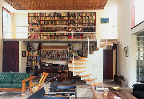
This is from a site named bookshelfporn that dedicates its bits to books and how to store them
[This was voted down--it is dated] 


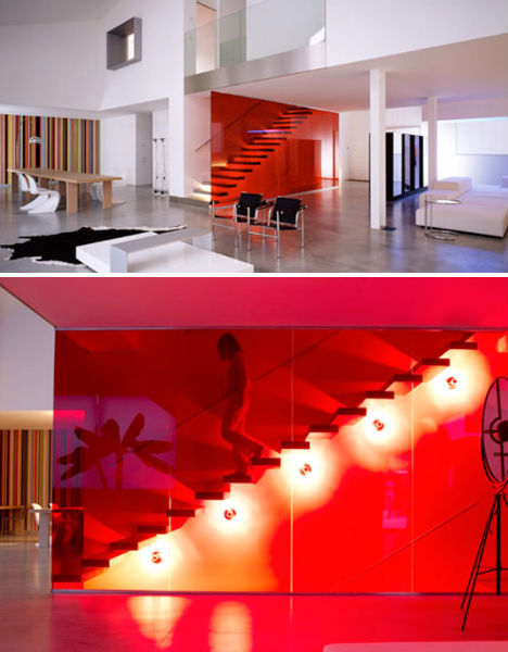
An Italian house. Needs different wall treatments but the split level is interesting, as are the interior windows.

Both the above from this site.  (Hopefully, it does not cobweb...)

Some notes--We have to think about some functions that do not complete on one floor:

  • Home to trip  (do you drag luggage?  how?)
  • Bike ride, jog, cross country, etc.  to home and shower and change  (the path to the magic stairway needs to be dirt resistant.)

Stairs

Stairs take up space and are unsafe the more they are used.  ideally, stairs should

  • Have a secondary use besides moving up and down
  • Take up the least area as possible
  • Be safe
  • Be flexible and change as needed.

I like this example of the Chand Baori (or Baodi) Well in India, about 800 CE.

Chand Baori Step Well - Abhaneri
Pilgrims were to wash themselves prior to entering the temple.  However, Rajasthan has a varying water level due to extremes of drought; pilgrims would have to search for water prior to entering the shrine.

The solution was to dig a 'step well' within the temple.  Lining the well with stone to the lowest drought level made a resistant surface that could be flooded by rising waters.  Making the walls stairs meant efficient use of space.  Therefore:

  • Stairs were part of the wall--secondary purpose
  • It is not clear what the tread width is, yet the well is big enough to accommodate the stair/wall.
  • Note the use of landings at each descending junction as well as the well corners.  This well had a large influx of pilgrims, yet even old and infirm could reach the water.  Even though there are no railings it appears that one could only fall about six steps before landing on a platform. -- Safety.
  • About the only thing wrong with the design is that it makes more access available as the water level rises, and therefore the well would be less needed.  Everything else is very well advanced.
Safety

Great paper with statistics and design information on stair accidents is here.  Stairs with the best ascending and descending speed with high quality foot contact have the following dimensions (p. 13ff):

  • Best ascent speeds with safety (RxT dimensions in inches): 8.7 x 12.3  (35.2 degree)
  • Best descent speed: 7.2 x 10.7  (33.9 degrees)
  • The best compromise for overall safety is a 35 degree stair with treads no less than 11 inches (95th percentile of foot length in US) (p.18)

It suggests a 'minor stair accident' is possible every 63,000 steps (p.41/45).  Considering a 10 foot rise between stories and a 9-inch riser gives 27 steps per round trip between floors.  Some calculations of return trips between floors per day:
  • 5-round trips per day per floor - 466 days between accidents
  • 10-round trips per day per floor - 233 days between accidents
It suggests:
  • Build floors around lifestyle themes to keep activity within the floor.  Like a department store, items are organized around themes to keep the shopper on one floor.
Ideas
  • Have a wet bar in the office area to avoid having to change floors to go to a kitchen
  • Kitchen--family area--open dining--even office on one level.
  • Garage to basement with close access to avoid going through multiple areas of the house (less steps)
  • more?

Images I like 


  • uses space for books, which are important to us. 
  • May be distracting when going up stairs.
  •  A possibility to go from ground floor to second floor using a loft plan.
  • Could be suspended to allow windows.
  • Could be in the NE corner of the building
  • Sky space is clear.  Forces upwards views from the ground floor.


Sunday, November 6, 2011

Workshop and industries

This is the Bug Labs test area.  I like the open view shelving.  Everything is visible in the plastic tubs.  (It looks like a slanted ELFA system)

The work surface is great too.  Designed for seating height and wide enough to place items on.

Kitchen Ideas


What is attractive about this kitchen is the layout.  This was a conversion of a colonial horse barn in Washington DC in about 1924.


  • Large windows
  • Big sink at the rear of the picture
  • A wall with the latest appliances that can be changed as needed.  (The picture has a Vulcan gas range in the foreground and a Westinghouse 'automated' electric oven in the background.)
  • A cabinet wall with ample storage
  • Well organized cabinets.
  • A central island that does not interrupt views
  • High technology.  (The mixer is the first Kitchen Aid Model G, made then by Hobart.)
As an aside, I always like to see how planners first approached cord management for the new appliances.  Many had power from above, which has merits, especially around stoves.  It avoids dragging cords over counters. 


Another kitchen layout from approximately 1920.  Things to like about this:
  • The open island with nothing obstructing the views.  This one may be too big, but the idea of two or more people working at the island are very common in our family
  • Well organized cabinets.  I like the cabinet under the clock.  Shallower drawers to allow tools not to get bunched up.
 Now look at these

  1.  

All have about the same amount of equipment.  Which is more appealing?  

Option 1 is the preferred.  The surface treatments are warmer with an open feeling.  Option 3 is a famous restaurant in Amsterdam on a boat.  It appears 'cramped', which it is since it is on a boat.